
Components
New! Venue listing component
A new component that displays venue pages from a specified folder or location.
Component example
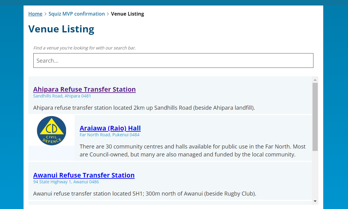
Component config
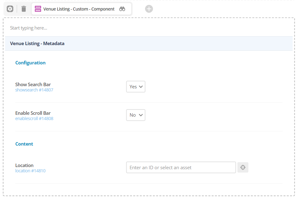
Component

NEW! Wave component
A new component that adds a dismissable wave at the bottom of the page, click on the wave to make it disappear.
Component
At the bottom of the page.
NEW! Table of contents component
A new component that adds a table of contents at the top of the page. The component creates the sections based on H2 headings. Configuration and scroll to the top button coming soon.
Changes planned:
- Section highlight based on which section you clicked.
- 1 section will display at a time, other sections will be hidden.
Component screen
Component
At the top of the page.
Call to action component
Component screen
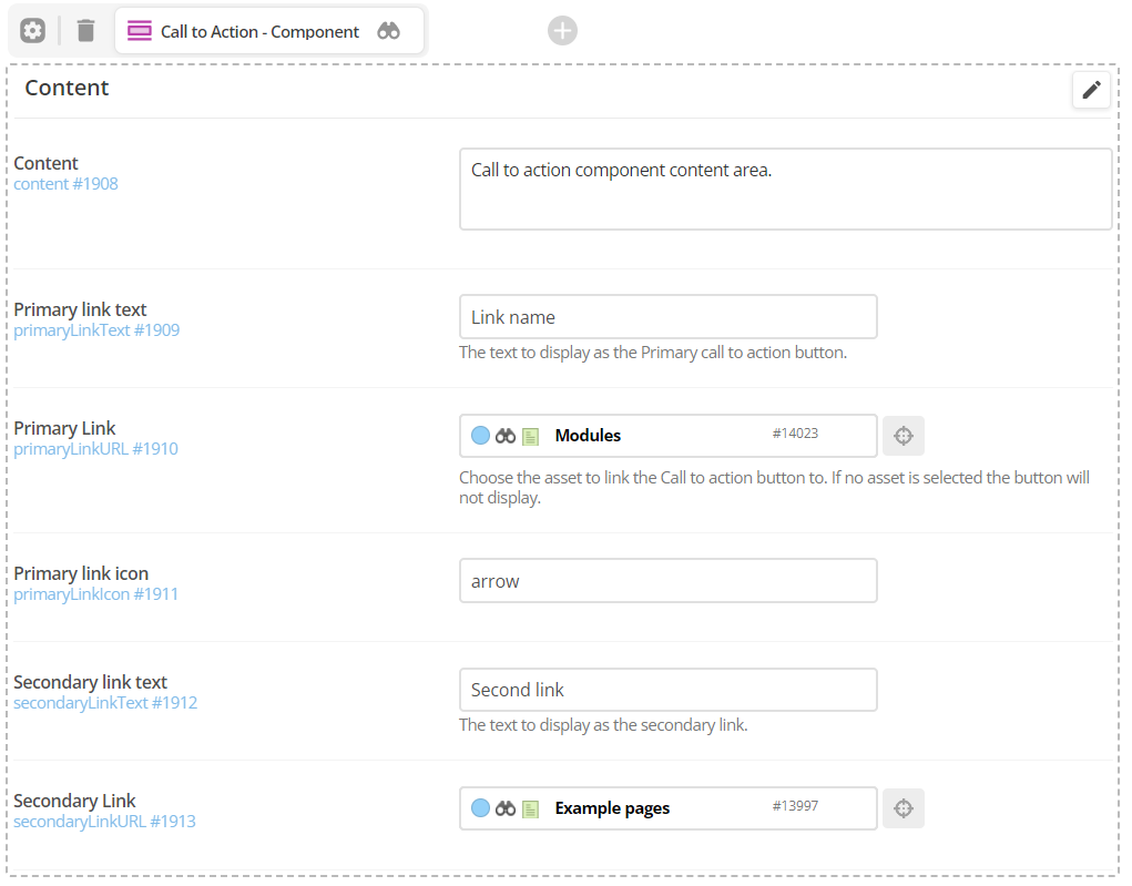
Component config
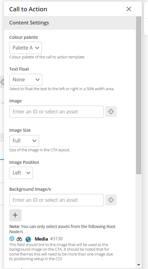
Component
Banner located at the top of the screen.
WYSIWYG Content component
Component screen
Component
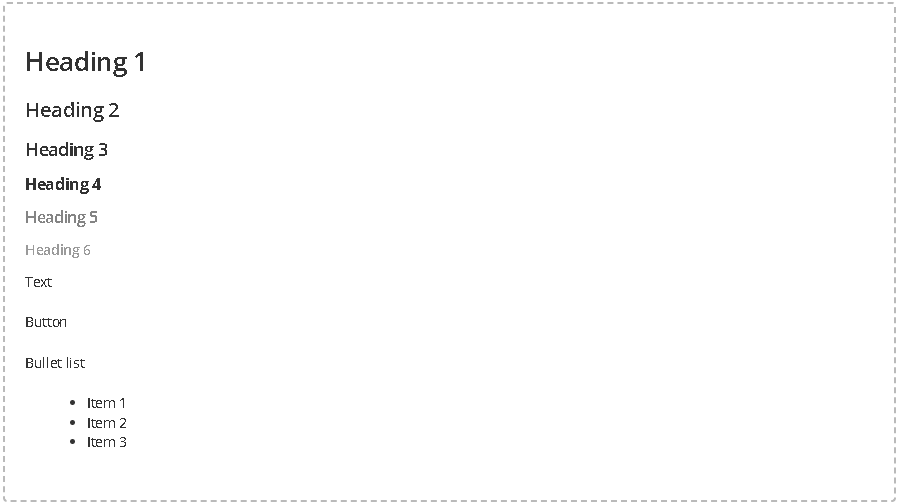
Heading 1
Heading 2
Heading 3
Heading 4
Heading 5
Heading 6
Text
Bullet list
- Item 1
- Item 2
- Item 3
Accordion
Component screen
Component config
Component
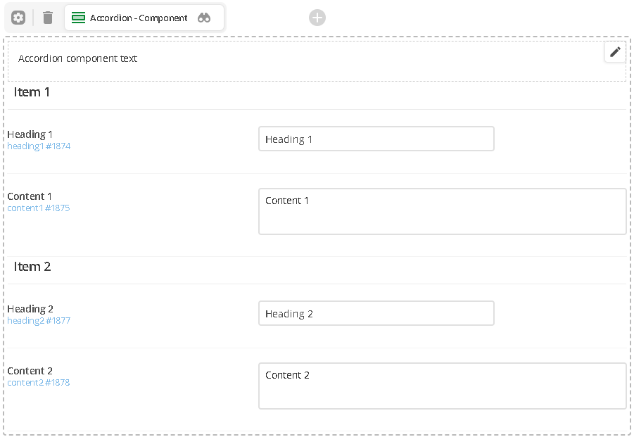
Accordion component text
Content 1
Content 2
Nested content
Use this component to insert content from another "contents" page.
Component screen

Component
Card listing via root node
Use this component to show pages in a grid format.
Component screen
Component config
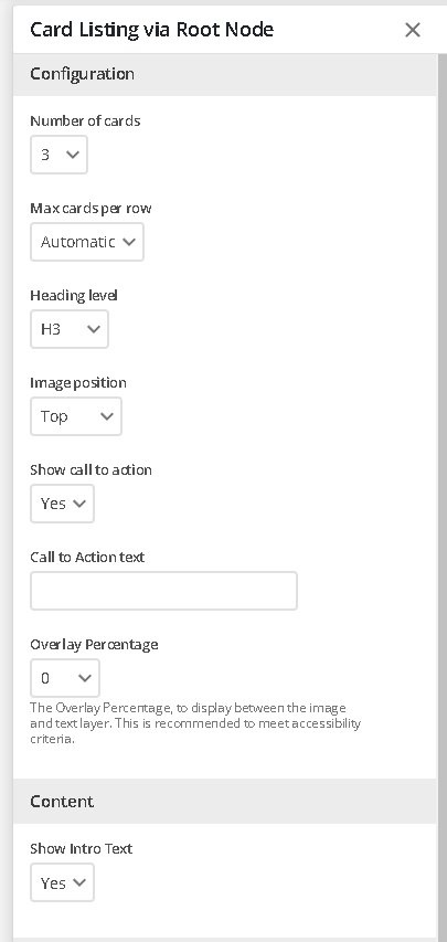
Component
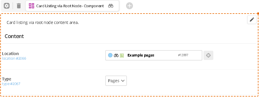
Card listing via root node content area.
Button
Component description and usage
Create a standalone button.
Component screen
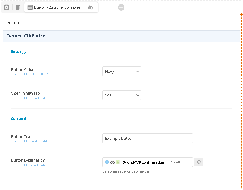
Component
Example button
Cards
Component description and usage
Create custom cards that show in a grid format.
Component screen
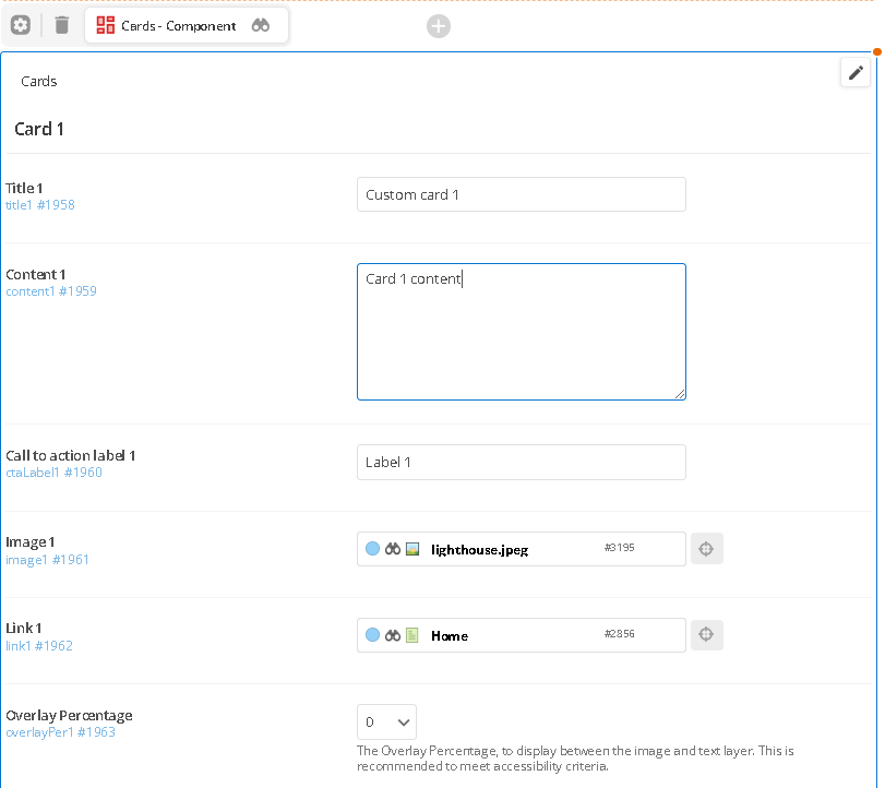
Component config
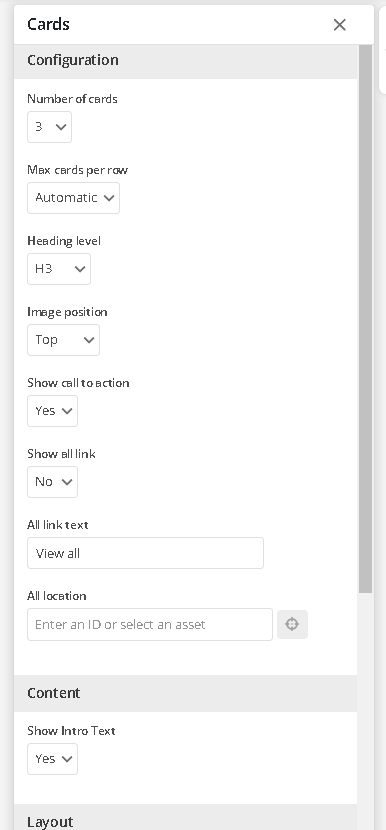
Component
Cards
-
Custom card 2
-
Custom card 3
Carousel
Component description
Useful for a scrolling image or banner style.
Component screen
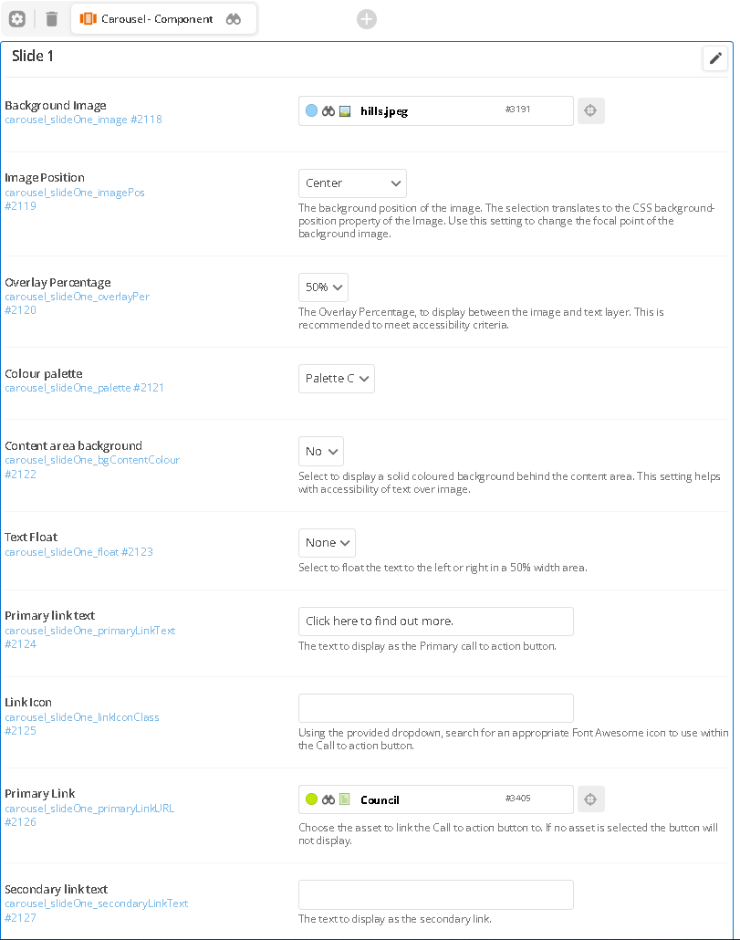
Component config
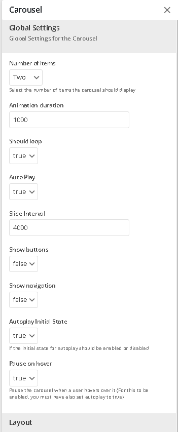
Component
We are closed over the holiday period and will be open in the new year.

Rates are due soon, plan ahead to make this payment period easier.

Document listing
Component screen
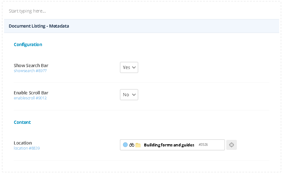
Component
Facebook feed
Component screen
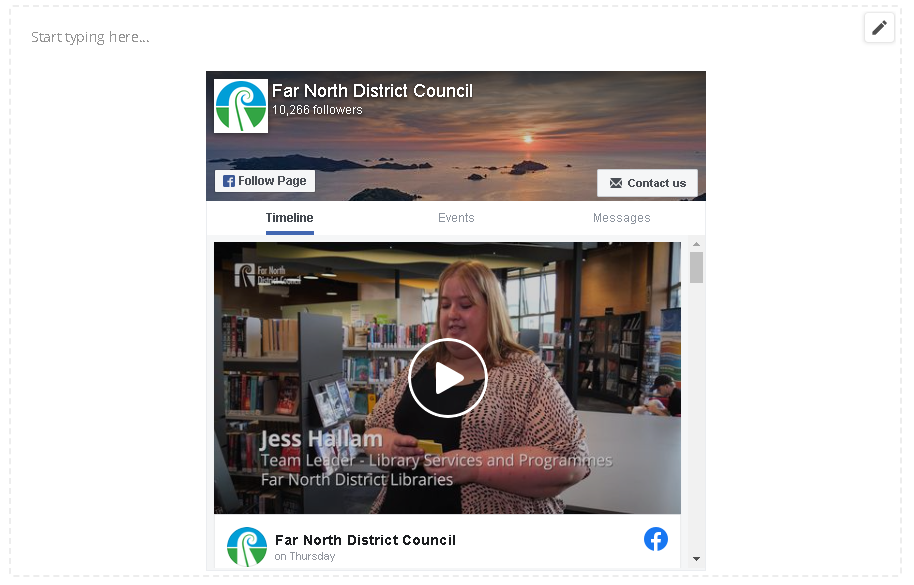
Component config
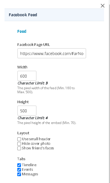
Component
Facebook feed content.
Google map
Component screen
Component config
Component
Tabbed group
Component description and usage
Component screen
Component config
Component
Content 1
Content 2
Multi-column content
Component screen
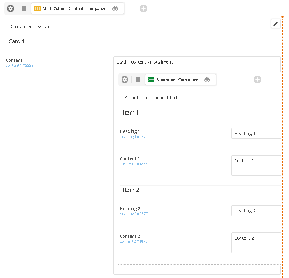
Component config
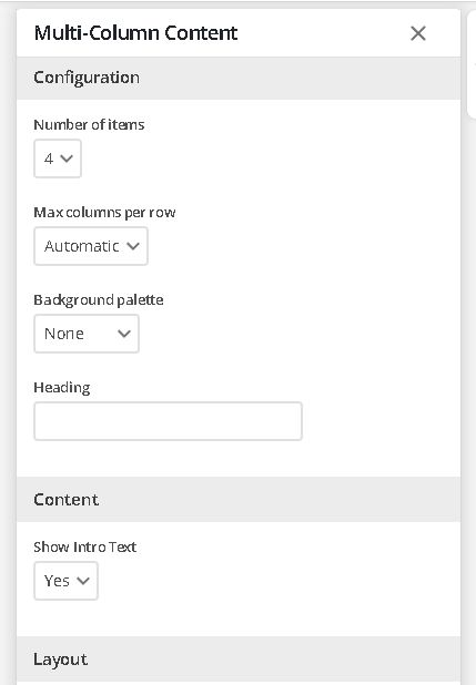
Component
Component text area.
Card 1 content - Installment 1

Card 2 content- Installment 2
Card 3 content- Installment 3
Card 4 content- Installment 4
